To use Native UI to your projects, copy the given link below and paste it in the head tag of your
html, above all other style sheets. And voila! Done.
Go ahead with the documentaion once you are ready with your stylesheet. To know about the styled
components, their variations, read the documentaion
You can use both dark and light themes according to your need.
Import all the icons used via font-awesome
Alert
Alerts are used to provide contexual feedback messages. It displays in a virtual box
that pops up on the screen.
Examples of Alert Bars
Alerts are available for any length of text, as well as an optional dismiss button. For proper
styling, use any of the following.
To use this alert just use class name alert and also add the
following class alert-primaryalert-secondaryalert-dangeralert-successalert-warning
(e.g.class="alert-box alert-primary")
A primary alert example.
A secondary alert example.
A success alert example.
A danger alert example.
A warning alert example.
Examples of Alert Bars with dismiss.
Alerts can also wait for the user to dismiss it.
To use this alert you just have to add a button with class btn-close and id alert-close-btn
A danger alert example
JavaScript
Avatar
The Avatar component is used to represent a user, and displays the profile picture, initials or
fallback icon.
Examples of Avatar with Image
The Avatar component comes in 5 sizes. For proper
styling, use any of the following.
To use this avatar just use class name avatar and also add class according to avatar type:
avatar-lg,
avatar-mdavatar-smavatar-xsavatar-lg
Examples of Avatar with text.
Avatars can also have text instead of picture.
To use this avatar just add a following class to previous classes i.e. avatar-text
H
H
H
H
H
Badges
The Badge component is used to represent a user's status - online, offline etc. They can also be used
to display a notification or cart count.
To use this badge component just use wrap the html in the div having a class named badge-component
Examples of Badges on Avatar
Examples of Bagde on icons.
To use this badge uou can copy html part from below code snippet.
The Button component is used to trigger an action or event, such as submitting a form, opening a
dialog, canceling an action, or performing a delete operation.
Examples of Primary Buttons
Primary actions, or things that we want the user to do as often as possible. Buttons that execute
primary actions—primary buttons—should be as visible as possible.
Floating buttons are used to perfom a particular function for example talking to a customer care
person, moving towards the top of the page etc.
Examples of Icon Buttons
Cards
A card is a flexible and extensible content container. It includes options for headers and footers, a
wide variety of content, contextual background colors, and powerful display options.
Examples of Card with Badges
Use to portray important information regarding what is being display on cards. Such as newBest Seller etc.
NEW
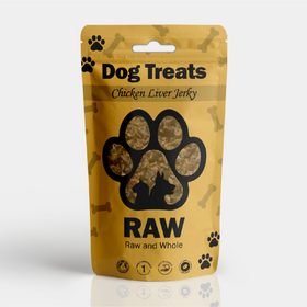
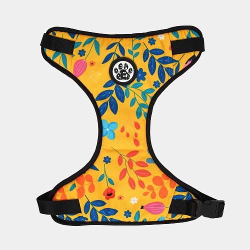
Dear pet Blooming Yellow Dog Harness
Rs 299
BEST SELLER
Dear pet Blooming Yellow Dog Harness
Rs 299
Example of Card with Dismiss
Native UI provides with dismiss option for cards too. Add the proper HTML code to use it.
Dear pet Blooming Yellow Dog Harness
Rs 299
JavaScript
Examples of Cards With Text Overlay
Disabled Cards are useful to depict a disable feature. For eg if the product if out of stock
, we can use them.
Dear pet Blooming Yellow Dog Harness
Rs 299
Out Of Stock
Examples of Text Only Cards and Shadow Cards
Cards with only textual information.
NATIVE PAWS:
INDIA'S FIRST ONLINE PET SHOP
Native Paws is the name that visions to comfort pets and pet parents by catering the
market of pet essentials. We aim to reach at every doorstep around the globe & serve
our
cuddle buddies the best quality products.
At Native Paws, you will find a flawless experience in searching for the right
product
for your pets.
Examples of Vertical Cards
Vertical cards provided by Native UI can be used for displaying products.
Dear pet Blooming Yellow Dog Harness
Rs 299
Examples of Horizontal Cards
Small devices, horizontal cards come to action.
Dear pet Blooming Yellow Dog Harness
Rs 299
Images
Images are an integral part of the content strategy of any website. They convey some important
information without the need of textual content.
All the images are responsive.
Examples of Responsive Images
Images should show responsive behavior so they never become larger than their parent elements.
Use class: img-responsivewhich adds a max-width: 100% and height:
auto
Examples of Round Images
Round or Cirular Images are used mainly for avatars or any image feature link.
Add a classimg-circularto the img tag to use this component.
Inputs and Forms
Inputs are the main component that is used for user's interaction with the web app. Inputs are used
to take important information from the user, and then save the data.
Example of Textbox
Textboxes are used to collect more detailed information from the user, rather than just providing
values or options.
Example of Input with validation and error
Validation for inputs is used to ensure that the user is not entering the false information or
leaving the field empty.
A simple sign up/ log in form could look like this.
Grids
Grids are very useful in arranging the content over the website hasle free.
Add class:
Add class: grid to the paren div. And add the
following as per requiremene.
grid-20-80 , grid-3-col , grid-50-50 ,
grid-4-col
Example of 20-80 grid systm,
20%
80%
Example of three column grid system
Add class: grid-3-col to the paren div.
1fr
1fr
1fr
Example of 50-50 grid system
50%
50%
Example of four column grid system
1fr
1fr
1fr
1fr
Lists
Lists can be used at so many places, navigation bar, stacked notifications, article pages, etc. They
can be nested or simple
Add class: list to the parent div. And add the
following as per requirement.
Modals are built with HTML, CSS, and JavaScript. They’re positioned over everything else in the
document and remove scroll from the so that modal content scrolls instead.
Example of Modal
Modal Title
Sunt ad dolore quis aute consequat. Magna exercitation reprehenderit magna aute
tempor cupidatat consequat elit dolor adipisicing. Mollit dolor eiusmod sunt ex
incididunt cillum quis. Velit duis sit officia eiusmod Lorem aliqua enim laboris
do dolor eiusmod. Et mollit incididunt nisi consectetur esse laborum eiusmod
pariatur proident Lorem eiusmod et. Culpa deserunt nostrud ad veniam.
Live Demo
For including a live modal, just add id = "live-modal-con"
Modal Title
Sunt ad dolore quis aute consequat. Magna exercitation reprehenderit
magna aute
tempor cupidatat consequat elit dolor adipisicing. Mollit dolor eiusmod sunt ex
incididunt cillum quis. Velit duis sit officia eiusmod Lorem aliqua enim laboris
do dolor eiusmod. Et mollit incididunt nisi consectetur esse laborum eiusmod
pariatur proident Lorem eiusmod et. Culpa deserunt nostrud ad veniam.
JavaScript
Navigation
A Navigation bar helps in accessing information. It is the UI element on a webpage that includes
links for the other sections of the website. The navbar provided by native is also responsive. It
will turn into a hamburger menu when the width decreases.
Native's 5-star ratings component can be used to allow the users to share their opinion about the
product, documentation page, photo and more.
Example of read-only ratings
Example of dynamic ratings
Slider
Sliders are used to decide range for something like sound in videos, price in shopping sites, etc..
Example of Slider with Value
Example of Slider with Icon
Typography
Typography is a feature of Native UI for styling and formatting the text content. It is used to
create customized headings, inline subheadings, lists, paragraphs, aligning, adding more
design-oriented font styles and much more.
Example of Headings
For heading u can use h1, h2, h3, h4, h5, h6 elements.
The same font-styling is present for class names h1, h2, h3, h4, h5, h6 class. You can add one
of these classes to style the text.
Toasts, sometimes called snackbars or banners, make for great medium-attention notifications
because
they are non-disruptive. Users can continue using the product while being informed about the
(hopefully) important stuff and any supplementary options to the current user action.
Example of Toast
Native UI provides different types of toast such as: success, error, normal and stacked.
Native
UI provides different types of toast such as: success, error, normal and stacked.
Add class: toast and add a following class: toast-success , toast-stacked , toast-content , toast-dismiss , toast-error.
